
Digitizing the Jim Guy Tucker Photographs
The Scope
Over 10,000 images are in the Jim Guy Tucker Papers. For this grant, I’m responsible for digitizing 3,000 to represent Tucker’s career and Arkansas politics in the late 20th century.
Around 5,000 of the images alone consist of negative strips from the governor’s office staff photographer, who captured day-to-day activities, from meeting school children to hosting foreign leaders to touring disaster areas. Tucker also donated photographs from his early political career and his time as a war photojournalist in Vietnam in 1965 and 1967.
The Challenge
The negatives present a special challenge for me. Scanners make duplicating photographic prints easy. As an archivist, I want the scan to represent the original as closely as possible. Prints make this comparison easy.
With negatives, digitizing the image to make it look like what’s in front of me is impractical. And when adjusting for light and color balance in the scan, I am not going to get much guidance from the original negative as to how it should have looked as a print.
(Of course, taking them to a print shop and having a trained photo technician print them out is also an option, but it would be much more expensive, especially when we have a scanner on hand that can capture the image.)
The Experiment
Problem: How do you know if you have a faithful reproduction if you do not have a print with which to compare?
For this experiment, I toyed around with the scanner software to determine what yielded the "best" looking scans. The most prominent gubernatorial events were often taken in color, and so these images will be high on the list to digitize.
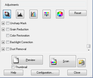
At the Center, we use an Epson Expression 10000XL- Photo Scanner. We also use Adobe Photoshop for post-scanning adjustments. When you scan a film negative, Epson automatically makes adjustments. However, you can reset these adjustments and pick and choose which adjustments you would like to use:
The Results
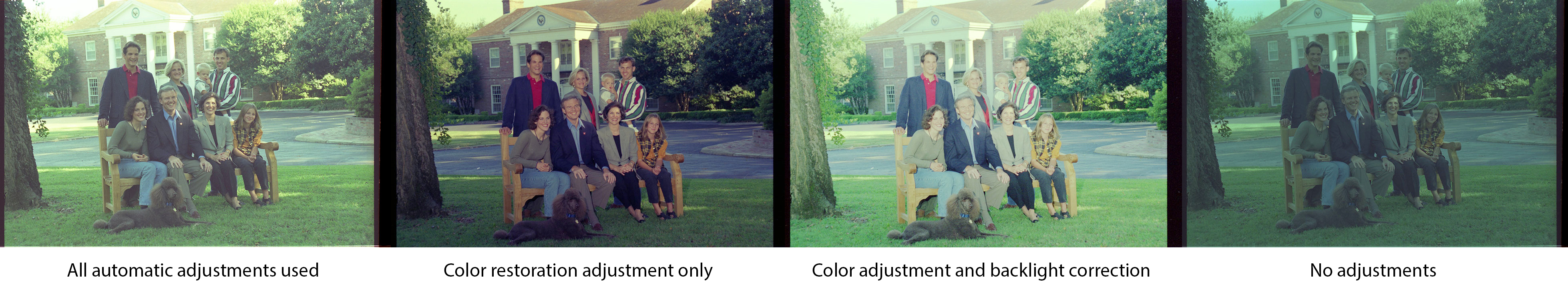
My first step was to see what the negatives looked like by choosing different options.
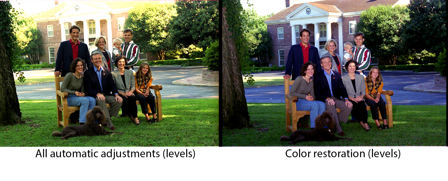
 To me, the second one looks best. It had a bit of a green hue, so in Photoshop, I used Auto Color, and this was the result:
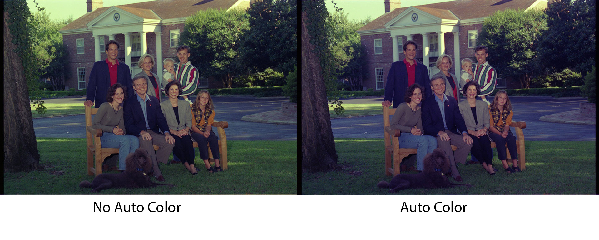 A little less green, a little more magenta, but it seemed like this was the best I could do without being a photo specialist.
My story could have ended there if not for a crucial discovery. A print had been developed from this photo shoot! (Albeit, one with slightly different poses). Here’s what the actual print looks like:
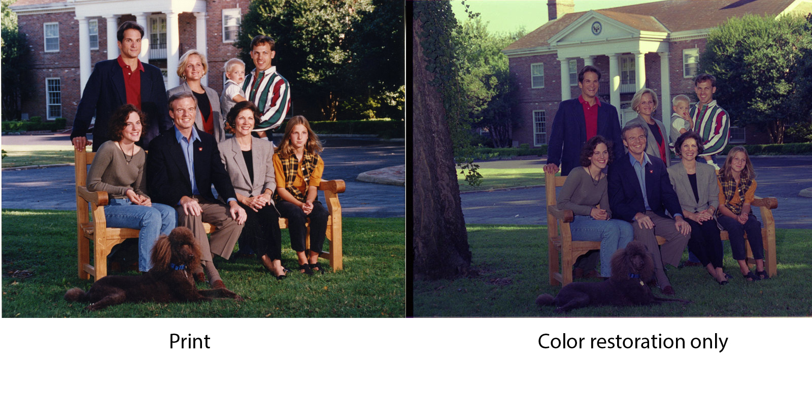 Curses! When compared to the print, the darker, green cast from my negative scan practically screams.
And at this point I turn to Google and trawled through blogs and forum posts written by photo enthusiasts. That is when I learned the magic that is the Levels menu in Adobe Photoshop. By doing a simple ctrl-L in Photoshop, I see a screen that looks like this:
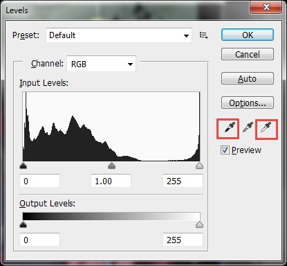
Using the white dropper, I selected what I believed to be the whitest part of the photograph and the black dropper to select the blackest. The color spectrum then calibrates itself accordingly, anchored by my choices in white and black.
My experiment with the scanning software settings is still relevant, because even if I adjust the levels, the images will look differently if scanned them using different settings:
I also found that the Auto Color option in Photoshop had no bearing on the outcome after adjusting for Levels, so I could eliminate that step.
Now let’s compare the print and the color-restoration version side-by-side:
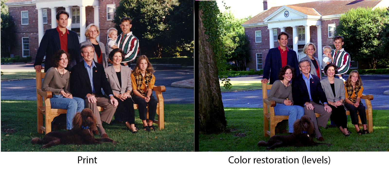 Not a perfect match, but much better.
For archivists, however, we have to ask ourselves, would it be worth spending that additional time perfecting an image?
Another complication is that while the color restoration-only negative matches the closest with the print, the all-automatic negative seems to produce the best details (albeit with a washed-out governor’s mansion). In the color restoration-only negative, the vivid color overpowers the nuances in light – probably since there is no backlight correction.
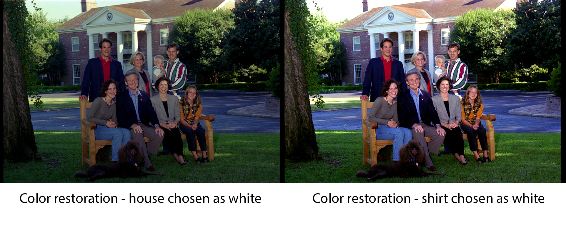
You also need to make subjective decisions about what is the “whitest” white or the “blackest” black, and it does make a noticeable difference (and you also need to hope that there is a black and white in the negative):
The plan for now is to scan the color negatives according to settings we can automate and then, close to the end of the digitization project, see how time allows for perfecting them.